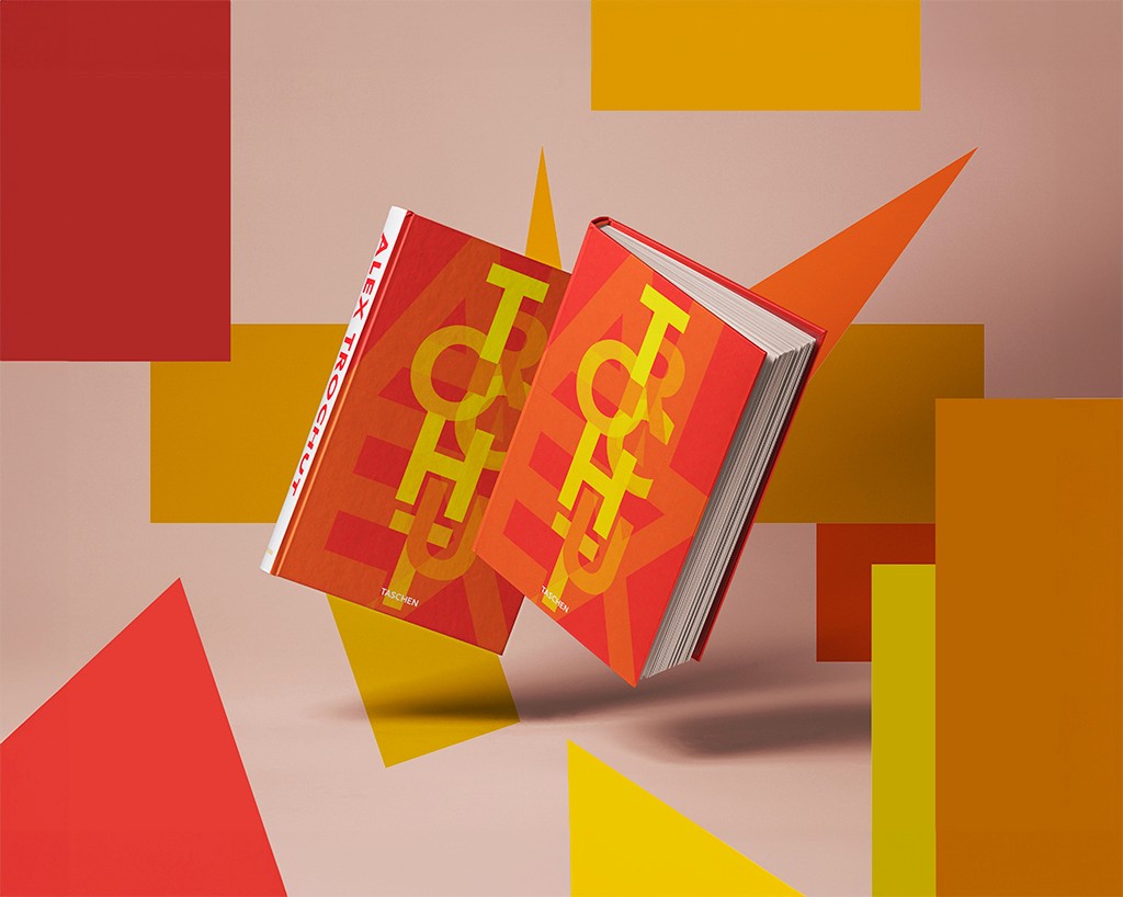


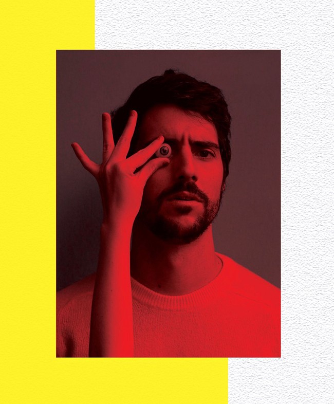
This personal book design for Alex Trochut encapsulates the vibrant, bold, and dynamic nature of the artist’s work. Known for his distinctive approach to typography and graphic design, this book serves as a visual journey through Trochut’s portfolio. The cover design and overall visual identity are a tribute to Trochut’s signature style—merging geometric abstraction with vibrant color palettes that reflect energy, movement, and creative innovation.
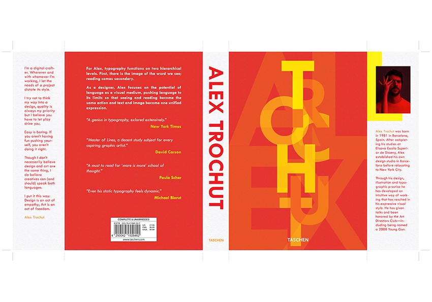
The design follows a modernist and geometric approach, using sharp lines, bold forms, and vibrant colors to capture the attention of viewers. The typography is playful yet structured, with overlapping layers of type creating depth and intrigue. The use of bright reds, oranges, and yellows provides a sense of warmth and movement, making the book feel alive and reflective of Trochut’s energetic creative process.
The goal of this book design was to represent Alex Trochut’s artistic identity through a bold and energetic visual language. The dynamic use of typography on the cover mirrors Trochut’s experimental approach to type, while the striking color palette emphasizes the intensity and vibrancy of his work. This design serves both as a personal portfolio and a creative manifesto, making it a visually compelling piece that reflects the essence of Trochut’s design philosophy.